Valued Naturals Bag Redesign
I was tasked with redesigning the artwork for Valued Naturals' stand-up pouch line, giving it a fresh, cohesive look that aligns with the brand’s simple aesthetic while adding more personality and visual appeal to stand out in convenience stores.
Beyond maintaining brand consistency, I needed to create a design that worked seamlessly with both printed bags from our vendor and in-house sticker labels. This required incorporating a large enough window while ensuring the label placement remained effective and visually appealing.

The Current Branding
Reseach
I researched current packaging trends and found that organic shapes, pops of color, and patterns were widely used to create engaging packaging. I also explored different label shapes to enhance the overall look.
From this research, I developed two distinct design concepts:
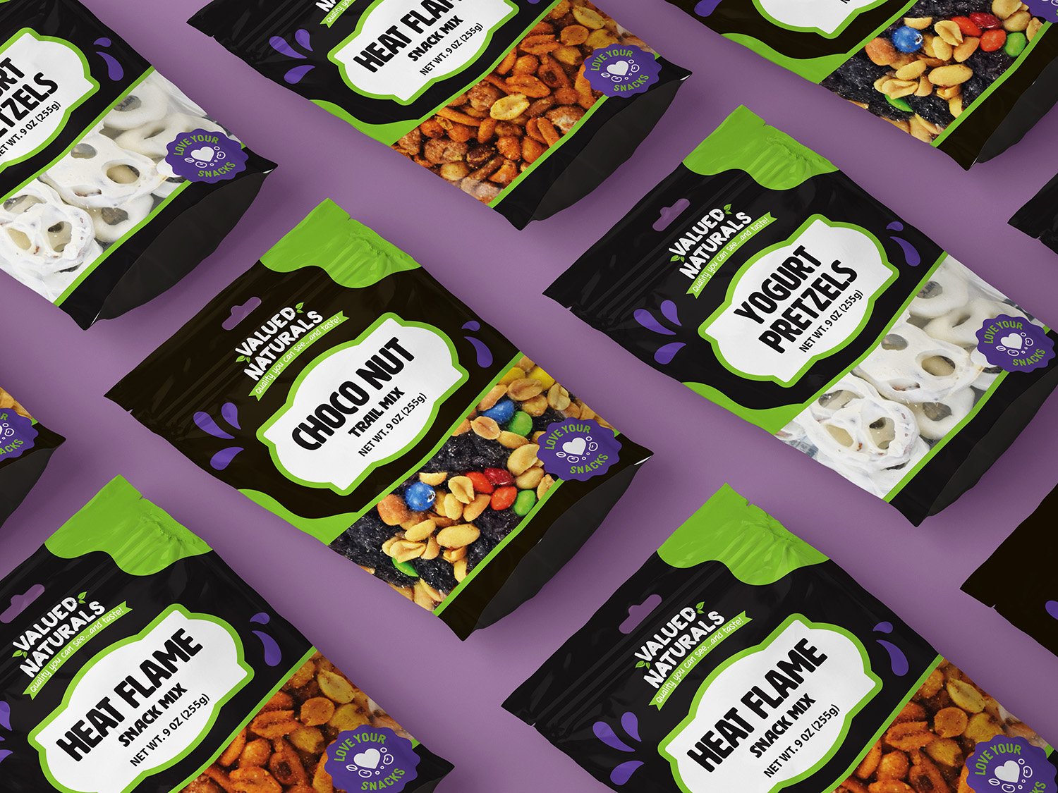
A vibrant, modern approach featuring organic shapes and the introduction of purple—complementary to the brand’s green—to add depth and contrast.
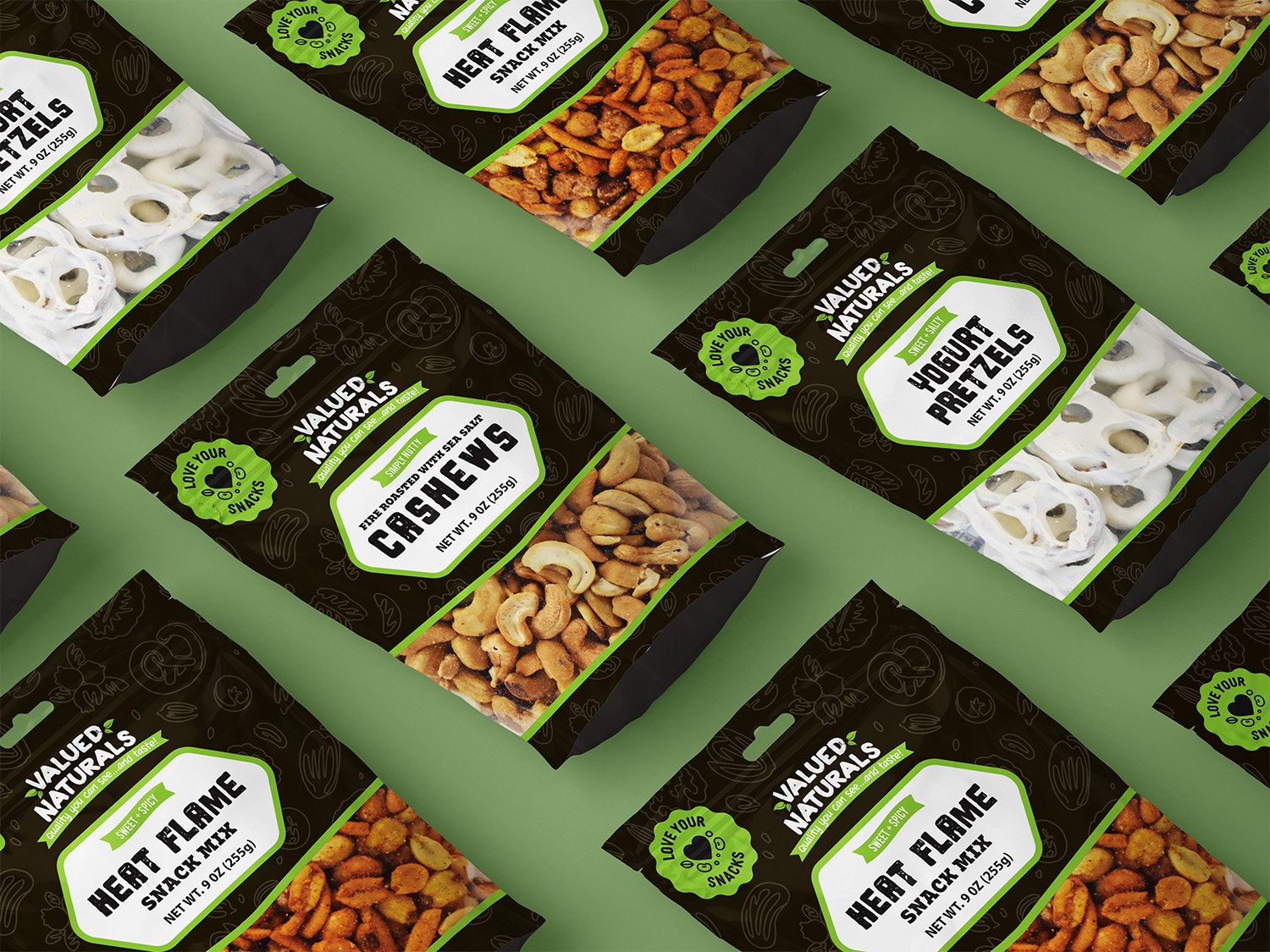
A more refined, elegant design with a slightly darker brown and subtle, faded patterns inspired by the nuts and snacks that Valued Naturals offers.
Both designs aimed to strike a balance between simplicity, functionality, and visual impact, ensuring that the packaging stands out while staying true to the brand’s identity


